How To Use Heat Maps for Direct Mail Targeting?
How to use heat map data to cut mail waste and lift responses, target smarter neighborhoods with a proven strategy. Visit MVP Mailhouse or book a demo

Reece Lyndon Mower
director of-Strategy
·18 min read
·Mar 12, 2026
If you are wondering how to use heat map data to improve direct mail performance, start here: direct mail is still a serious performance channel, with marketers projected to spend $37.3 billion in 2024, and 81% of brands saying they intend to increase spend in 2025. At the same time, classic direct mail benchmarks still show response rates far above what many marketers expect, including roughly 9% for house lists in USPS-cited industry data.
That is exactly why heat maps matter. The Data & Marketing Association’s response rate data shows that direct mail can generate response rates of 9% for house lists and 4.9% for prospect lists, which is exactly why audience quality and geographic targeting have such a direct impact on campaign profitability.
They help you stop mailing broad areas blindly and start identifying where a response is most likely to happen.
That is exactly why heat maps matter. They help you stop mailing broad areas blindly and start identifying where a response is most likely to happen. In practical terms, a heat map turns location data into a visual decision-making tool. Instead of asking, “Who should we mail?” you begin asking, “Which neighborhoods are most likely to convert, and why?” For dental practices, home service brands, and local multi-location businesses, that shift can mean lower wasted postage, stronger conversion rates, and a much clearer path to profitable growth.
We’ve seen this happen repeatedly: businesses do not usually fail because direct mail “doesn’t work.” They fail because they mail too wide, too evenly, and too early without understanding where the strongest demand is clustered. A good heat map fixes that.
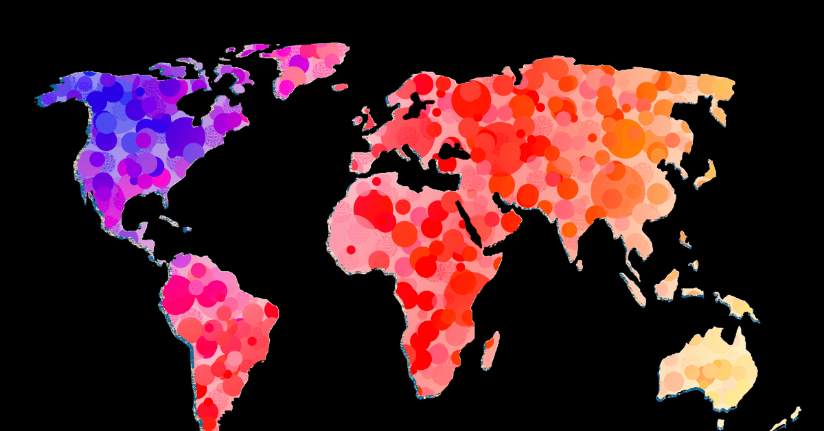
What A Heat Map Actually Does in Direct Mail
A heat map for direct mail shows geographic concentrations of opportunity. It highlights the ZIP Codes, carrier routes, census areas, or neighborhoods where your best prospects are most likely to live. Hotter areas indicate stronger potential based on the variables you choose, such as household income, homeownership, age bands, family composition, new mover activity, historical response, or proximity to your location.
That matters because geography shapes buying behavior more than many marketers admit. Distance affects convenience. Neighborhood makeup affects offer relevance. Local competition affects conversion odds. And in service-driven categories like dental, timing and location often matter just as much as creativity.
This is where a lot of campaigns go wrong. Teams often treat mailing lists as static files instead of dynamic local-market intelligence. In reality, the list is only the output. The targeting logic comes first. If you need a foundational explanation of the visual side of this process, what is a heat map in marketing is a useful starting point. If you want the direct-mail-specific mechanics, how does a heat map work in direct mail covering that next layer.
A strong heat map is not just a picture. It is a ranking system. It helps you answer questions like these:
- Where are our highest-probability prospects concentrated?
- Which neighborhoods are close enough to act?
- Where are we overspending on low-fit households?
- Which areas deserve a test before a full rollout?
Those are the questions that turn a campaign from “spray and pray” into a real direct mail targeting strategy.
Why Heat Maps Outperform Broad Geographic Targeting for Direct Mail
Broad local targeting feels safe, but it usually hides waste. USPS-backed reporting notes that 74% of marketers say direct mail delivers a better response rate than other channels they use, which is one reason brands continue leaning into the channel. But strong channel performance does not excuse weak targeting. A good medium can still produce mediocre results when you send it to the wrong geography.
That is why geographic targeting for direct mail works best when it is selective, not generic.
Here is the simple truth: not every neighborhood around your business is equally valuable. Some areas have stronger income alignment. Some have better household stability. Some have the right age or family profile. Some are close enough to your location to make response easy. Others look fine on a map but produce weak economics once the campaign lands.
We’ve seen this happen with dental campaigns in particular. A practice may assume the closest neighborhoods are automatically the best fit. Sometimes they are. Sometimes they are not. In many markets, the best-performing pockets are not the neighborhoods nearest the office, but the ones with the right mix of insurance fit, household composition, commute patterns, and competitive whitespace. That is a big reason why dentists target neighborhoods that should never come down to radius alone.
Heat maps improve this by helping you layer logic onto geography. For example, a dental office trying to attract new family patients might prioritize neighborhoods that show:
High concentrations of owner-occupied homes, a healthy share of households with children, strong median household income, and a realistic drive time to the office.
A cosmetic-focused dental practice may prefer a different cluster entirely.
That is the real advantage of geographic heat maps for marketing: they let you match your business model to the right local audience instead of assuming one message fits every nearby mailbox.
In most campaigns, this produces three immediate benefits.
- First, waste drops. You stop treating every route equally and start excluding areas that look convenient but do not fit.
- Second, message relevance improves. When you understand the area, your offer gets sharper. A new mover message, family-dental offer, or premium elective-service package can be distributed where it actually makes sense.
- Third, performance becomes easier to measure. Once areas are ranked, you can compare response by cluster, learn faster, and reallocate budget with confidence. That is one reason it helps to understand direct mail targeting: a guide to smarter campaigns before building your next list.
The First Rule: Define What “hot” Means Before You Build The Map
This is the step most businesses rush past, and it is usually where campaign quality is won or lost.
A heat map is only as smart as the inputs behind it. Before you map anything, define what a high-value prospect looks like. Not vaguely. Specifically.
For example, if your campaign goal is new-patient acquisition for a dental practice, “hot” might mean neighborhoods with mid-to-upper household income, family density, high owner occupancy, low distance friction, and historically solid response to healthcare or local service offers. If your goal is reactivating lapsed patients or pushing elective treatments, your criteria may be completely different.
We’ve seen marketers skip this step and jump straight to visuals. The result is usually a beautiful but strategically weak map. It looks sophisticated, but it does not actually improve decisions.
A better process is to define your scorecard first. That may include:
- Distance from business location
- Household income or home value
- Presence of children
- Age brackets
- Homeownership status
- New mover activity
- Past campaign response rates
- Existing customer density
- Competitive saturation
This is where location-based marketing becomes practical rather than theoretical. You are not just targeting a place. You are targeting the right kind of demand within that place.
Just as important, you need to decide what outcome the campaign is supposed to drive. Response rate? Appointments booked? Cost per acquired customer? Lifetime value? That choice affects how you build the map and what you prioritize. Without that clarity, “hot” becomes subjective, and subjectivity is expensive.
In our experience, the best campaigns usually show results in phases. In the first 4 to 8 weeks, a strong heat-map-led campaign should at least clarify which neighborhoods engage, which offers resonate, and where budget is being wasted. By the next cycle, the KPI focus should tighten around response rate, conversion to appointment or lead, cost per acquisition, and revenue per mailed area. Businesses that do this consistently tend to get smarter with every drop, while businesses that skip the learning loop keep paying tuition on every campaign.
Build Your Heat Map Around Business Data First, Demographic Data Second
The biggest mistake in heat-map-based targeting is relying on demographic data alone. Income, homeownership, and family composition matter, but they are supporting signals. The strongest maps usually start with actual business performance data.
That means looking at where your current customers live, where your best customers come from, which ZIP Codes have produced strong responses in previous campaigns, and which areas generate appointments that actually turn into revenue. If you skip that step, you risk building a map that looks logical on paper but does not reflect how people buy from you in the real world.
We’ve seen this happen more than once. A business builds a polished map around affluence and proximity, mails the “right-looking” neighborhoods, and then wonders why results feel average. Then they overlay customer history and realize the true hotspots were slightly farther out, or concentrated in family-heavy pockets they had barely prioritized. That is why a serious targeting process should include data analytics in direct mail marketing, not just surface-level list filtering.
A Practical Model Is To Start with Three Data Layers:
Your internal data, your market data, and your response data.
Internal data includes existing customers, past responders, average order value or patient value, and repeat behavior. Market data includes demographics, housing signals, distance, and household composition. Response data includes what happened in previous drops by area. When those three align, your heat map becomes far more than a visual aid. It becomes a decision engine.
For example, if a dental practice sees that certain neighborhoods consistently produce higher-value family cases, stronger recall rates, or better treatment acceptance, those neighborhoods should receive more weight than an area that merely looks affluent. That is how smart operators approach how dentists target neighborhoods without falling into generic radius marketing.
Score neighborhoods before you select them
A heat map works best when it reflects a scoring system, not a guess.
That score does not need to be complicated. In fact, simpler is usually better, especially early on. What matters is that each neighborhood, route, or ZIP Code is evaluated against the same rules. This is what turns a visual map into a reliable direct mail targeting strategy.
A basic scoring framework might look like this:
- Distance from your location, match to ideal household profile, strength of past response, current customer density, and competitive opportunity.
- Each factor gets a weight. Then every target area gets a total score.
Here is a simple example for a general dental campaign:
Distance might account for 25%. Household fit might account for 30%. Historical response might account for 25%. Existing patient concentration might account for 10%. Competitive whitespace might account for 10%.
This kind of structure forces discipline. It also prevents the common problem of choosing areas based on instinct, familiarity, or whoever speaks loudest in a marketing meeting.
We’ve seen this happen too often: someone says, “Let’s hit the neighborhoods around the office again,” because they know the area, not because the numbers support it. That approach feels safe, but it often hides mediocre performance. A scoring model is not glamorous, but it consistently produces better targeting decisions.
It also gives you a better framework for testing. Instead of mailing one giant mixed territory, you can group areas into tiers:
- Tier 1 are the strongest-fit neighborhoods.
- Tier 2 are promising but less proven.
- Tier 3 are test areas that need validation.
That structure matters because direct mail budgets are finite. You should not spend Tier 1 money on Tier 3 confidence.
Use Drive Time, Not Just Distance
This is where many local campaigns quietly lose efficiency.
A neighborhood that is three miles away may not behave like a nearby market if traffic patterns, road access, or local travel habits make the trip inconvenient. On the other hand, an area six or seven miles away may produce strong response because it has an easier route, better community fit, or fewer competitive barriers.
This matters a great deal in local service marketing. For a dental practice, convenience often becomes a conversion factor. A prospect might like the offer, trust the brand, and still never book if the trip feels annoying. That is why geographic targeting for direct mail should include real-world travel friction, not just radius circles.
We’ve seen campaigns improve after businesses stopped thinking in perfect circles and started thinking in realistic commute zones. That shift often changes the map more than expected.
A More Accurate Heat Map Tends to Separate Areas Like This:
One group is close and easy to reach. Another is close but inconvenient. Another is farther away yet highly accessible. Another may look good demographically but is too competitive or too hard to reach regularly.
Those distinctions change performance.
For dental and healthcare campaigns, we usually think convenience deserves heavier weight than marketers assume. People may travel farther for a specialist or major purchase, but for routine care, practical access matters. That is not theory. It shows up in response patterns over and over.
Match The Offer To The Neighborhood, Not Just The Brand To The Neighborhood
This is where heat maps become truly useful.
A lot of marketers use geographic targeting to decide where to mail, but the better move is to also use it to decide what to mail. The best neighborhoods for a family-oriented new-patient offer may not be the best neighborhoods for cosmetic dentistry, implants, or reactivation messaging. The audience is not just geographic. It is situational.
That is one reason broad, one-size-fits-all campaigns underperform. They may be going to decent areas, but the message does not match the priorities of those households.
We’ve seen this happen in direct mail for local service businesses all the time. One area responds strongly to value-forward messaging. Another responds better to trust, convenience, and reviews. Another needs a new mover offer because household transition is the real trigger. Same brand. Same city. Different local motivations.
That is why geographic heat maps for marketing should influence message strategy, not just route selection.
For example, a dental office might separate neighborhoods into practical groups such as these:
Family-heavy homeowner areas may be better for exam-and-cleaning offers, convenience messaging, or bundled household care language. Higher-income mature neighborhoods may respond better to premium services, cosmetic positioning, or trust-and-expertise framing. New mover clusters may respond best to “welcome to the neighborhood” style offers with a strong introductory hook.
The point is not to overcomplicate every campaign. The point is to stop pretending every area deserves the same mail piece.
This is also where your mailing file needs to be built carefully. If your list quality is weak, even a good map will underdeliver. That is why what is a mailing list in direct mail and why it matters should be part of the planning process, not an afterthought.
Turn Hot Zones Into A Phased Mailing Plan
Once your map identifies high-potential areas, the next step is not to blanket everything at once. It is to phase the rollout.
This is one of the clearest differences between average direct mail and disciplined direct mail. Average campaigns try to win in one drop. Smarter campaigns use early drops to confirm where the real efficiency lives, then expand with evidence.
A phased approach usually looks like this:
Start with your highest-scoring neighborhoods first. Measure response and conversion carefully. Adjust the offer, volume, or area selection based on actual results. Then scale the strongest zones while reducing or eliminating underperformers.
We’ve seen this approach save campaigns that would have looked disappointing in a full-market rollout. A test zone that wins clearly gives you a repeatable model. A test zone that underperforms teaches you where not to force budget. Both outcomes are useful.
In practical terms, a first wave often works best when it is limited enough to learn from, but large enough to produce signal. Then the second and third drops become smarter. By then, you are not just mailing hot-looking areas. You are mailing proven ones.
This is also where KPI discipline matters. If you are not tracking the right metrics by geography, your heat map becomes decoration. You need to know which neighborhoods produced inquiries, appointments, sales, revenue, and return on spend. For that, what are direct mail KPIs gives the right baseline, especially if you want your map to improve with each campaign cycle.
A realistic timeline looks like this:
In the first 30 days after an initial drop, you should expect early response patterns to emerge by area. Within 60 to 90 days, you should know which neighborhoods deserve more budget, which need a different offer, and which should be deprioritized. By the second or third campaign cycle, a well-run heat-map strategy should begin lowering waste and improving cost per acquisition compared with untargeted local saturation.
That is the difference between using a map as a visual and using it as a performance tool.
Measure Performance By Geography Or Your Heat Map Will Never Get Smarter
A heat map is not a one-time planning tool. It should become part of an ongoing feedback loop.
This is where a lot of campaigns stall. The map helps choose neighborhoods, the mail goes out, and then reporting gets rolled up into one campaign total. That is a mistake. If you only know the overall response, you miss the real lesson. You need to know which neighborhoods pulled their weight, which looked promising but underperformed, and which deserve a second look with a different offer.
We’ve seen this happen often. A campaign gets labeled “good” or “bad” too early because the team looked at blended results instead of area-level performance. Then they either scale waste or abandon a channel that was actually working in the right pockets.
A better approach is to track direct mail results by ZIP Code, route, carrier area, or neighborhood cluster. That lets you answer the only questions that really matter:
- Which hot zones are converted. Which ones only generated interest. Which ones did nothing. And which ones might perform with a stronger message, better timing, or a cleaner list.
For dental and other local service campaigns, the most useful metrics usually include response rate, appointment rate, cost per appointment, show rate, conversion to treatment, and revenue per mailed area. If your business needs a more vertical-specific benchmark, how to measure direct mail success for dental practices is the right place to go deeper.
In practical terms, here is what strong optimization usually looks like over time:
After the first drop, identify the top-performing areas and bottom-performing areas. After the second drop, compare whether the strongest areas held up or whether the first result was noise. After the third drop, you should have enough evidence to shift more budget into proven neighborhoods and cut areas that continue to drain spend.
That is where direct mail starts compounding. Not because the map was pretty, but because the business learned from it.
Common mistakes that make heat maps less useful
Most heat map failures are not technical. They are strategic.
The first mistake is using too little data. If the map is based on one variable, such as income alone, it will usually oversimplify the market. Affluence can matter, but it is not a magic signal. We have seen affluent neighborhoods produce weak results because the offer was wrong, the competitive landscape was crowded, or the customer need was lower than expected.
The second mistake is treating every hotspot as equally ready to mail. A neighborhood can look strong on paper and still need a different message, format, or timing. Heat maps help identify where opportunity may be concentrated. They do not remove the need for testing.
The third mistake is building the map around assumptions rather than evidence. Teams often think they know their market because they know the city. That is not the same thing as knowing which households are most likely to respond.
The fourth mistake is poor list execution. Even a smart geographic strategy can fall apart if the mailing file is weak, outdated, or built without clear selection logic. That is why list creation deserves more respect than it usually gets. If you are refining your targeting process, how to create a mailing list for direct mail is worth reviewing alongside your map strategy.
The fifth mistake is expecting instant perfection. In our experience, the first campaign rarely reveals everything. What it should do is create directional clarity. You should leave the first drop knowing more than you knew before. By the second and third cycles, your results should become more efficient if you are actually applying what the data shows.
That is the part many businesses skip. They gather insights, but they do not act on them. Then they wonder why performance plateaus.
What Realistic Results Look Like When Heat Maps are Used Well
A strong heat-map-led campaign usually does not create miracles overnight. It creates focus, and focus improves outcomes.
In the first campaign cycle, the clearest win is usually reduced waste. You begin to see which neighborhoods justify mailing and which do not. That alone can improve budget efficiency fast.
By the second cycle, the win is usually stronger consistency. Mail volume is moving into better-fit areas, weaker zones are being trimmed back, and the offer is starting to align more closely with local demand.
By the third cycle, the best campaigns usually start showing the bigger payoff: lower cost per acquisition, stronger response from priority neighborhoods, and more confidence in future expansion decisions.
We’ve seen this happen in local service businesses repeatedly. Once the targeting gets tighter, everything downstream gets easier. Creative improves because the audience is clearer. Offers improve because the need is better understood. Measurement improves because the geography is organized. Even internal decision-making gets faster because the team is not debating broad assumptions anymore.
That is why we are opinionated about this: businesses that use heat maps as a real operating tool tend to outperform businesses that use them as a presentation graphic. The difference is not subtle. One approach informs action. The other just looks strategic.
Conclusion
Knowing how to use heat map data for direct mail targeting comes down to a few core principles. Start by defining what a high-value prospect actually looks like. Build your map using real business data, not just generic demographics. Score neighborhoods instead of choosing them by instinct. Account for access and convenience, not just distance. Match offers to local audience conditions. Then measure results by geography so every campaign gets smarter than the last.
That is the real value of heat maps in direct mail. They help you stop mailing everywhere and start mailing where a response is most likely to happen. For businesses that want a sharper direct mail targeting strategy, better geographic targeting for direct mail, and more confidence in how dentists target neighborhoods or other local markets, that shift can be the difference between average performance and sustained growth.
If you want to build more targeted, measurable, and profitable direct mail campaigns, visit our website to explore more resources, or schedule a demo to see how MVP Mailhouse can help you turn geographic insights into better mailing decisions.
Tags
Frequently Asked Questions
Related blog