What is a Heat Map in Marketing?
What is a heat map in marketing? Learn how it works, what it reveals, and how to use it to improve targeting, ROI, and campaign performance.

Reece Lyndon Mower
director of-Strategy
·13 min read
·Feb 28, 2025
What is a heat map and why are so many marketers quietly relying on it to make smarter decisions? In simple terms, a heat map is a visual representation of data where colors indicate intensity, helping you instantly see patterns that would otherwise stay buried in spreadsheets. And it’s not just a nice-to-have. According to a study by Nielsen Norman Group, users spend 80% of their time looking at information above the fold, making visual behavior tracking critical for performance-driven marketing strategies.
This article breaks down how heat maps actually work, what they’re used for, and why they’ve become essential in high-performing campaigns especially in industries like dental marketing and direct mail where precision targeting directly impacts ROI.
What Is a Heat Map in Marketing?
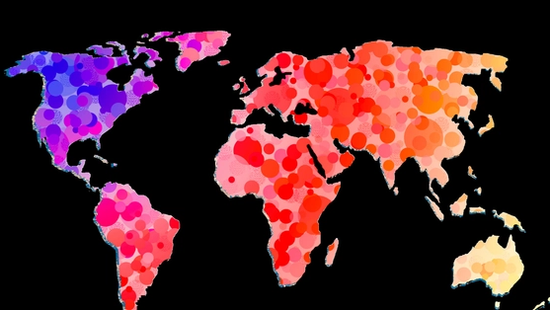
A heat map in marketing is a data visualization tool that uses color gradients typically red for high engagement and blue for low to show how users interact with content, locations, or audiences. Instead of scanning raw data, marketers can quickly identify where attention concentrates and where it drops off.
A heat map answers a simple but powerful question: Where is your audience actually engaging?
In digital environments, that might mean tracking clicks, scroll depth, or cursor movement. In direct mail marketing, it translates into geographic performance highlighting neighborhoods or zip codes that respond best to your campaigns.
In practice, this kind of visibility changes how decisions are made. Campaigns stop relying on assumptions and start responding to patterns.
What Is a Heatmap Used For?
Heat maps are used to uncover behavioral insights that directly influence marketing performance. They don’t just show what happened they reveal why certain areas outperform others.
Across campaigns, we’ve seen heat maps used to:
- Identify high-response geographic zones in direct mail campaigns
- Optimize ad placement and messaging based on engagement clusters
- Refine targeting strategies for local businesses like dental practices
- Improve conversion rates by focusing on high-interest areas
For example, in direct mail, a heat map can show which neighborhoods consistently generate higher patient inquiries. Instead of spreading budget evenly, marketers can double down on high-performing zones.
This aligns closely with strategies outlined in direct mail targeting, where precision matters more than volume.
The data shows that targeted campaigns can outperform non-targeted ones by up to 3x in response rate (DMA, Data & Marketing Association). That gap often comes down to understanding where your audience is most responsive and heat maps make that visible.
How Does a Heat Map Work?
To understand how a heat map works, think of it as a translation layer between raw data and actionable insight.
Behind the visuals, heat maps aggregate large datasets whether user behavior, geographic response rates, or demographic patterns and assign values based on activity levels. These values are then mapped using a color scale.
Here’s how that process typically unfolds:
- Data Collection: Data is gathered from sources like website interactions, CRM systems, or direct mail response tracking.
- Data Segmentation: The data is grouped based on relevant variables location, behavior, or campaign response.
- Intensity Mapping: Each segment is assigned a value. Higher engagement or response rates receive “hotter” colors (reds/oranges), while lower activity shows as cooler tones (blues/greens).
- Visualization: The final output is a visual map that highlights patterns instantly.
For a deeper breakdown, you can explore how a heat map works in direct mail, especially if you're applying this to physical campaigns rather than digital tracking.
In practice, this process eliminates guesswork. Instead of asking which areas might work, marketers can see which areas already do.
How Heat Maps Work in Marketing Campaigns
Heat maps aren’t just analytical tools, they’re decision-making frameworks. When used correctly, they reshape how campaigns are planned, executed, and optimized.
Across marketing channels, heat maps typically fall into two categories:
Behavioral Heat Maps (Digital)
These track how users interact with websites or landing pages: clicks, scroll depth, and attention zones.
The data shows that optimizing layouts based on behavioral heat maps can increase conversions by up to 20–30% (CXL Institute). That’s not incremental, it’s transformative.
According to heatmap statistics research, websites that use heat map analysis to track user behavior can improve conversion rates by up to 30%, making it a powerful tool for data-driven marketing decisions.
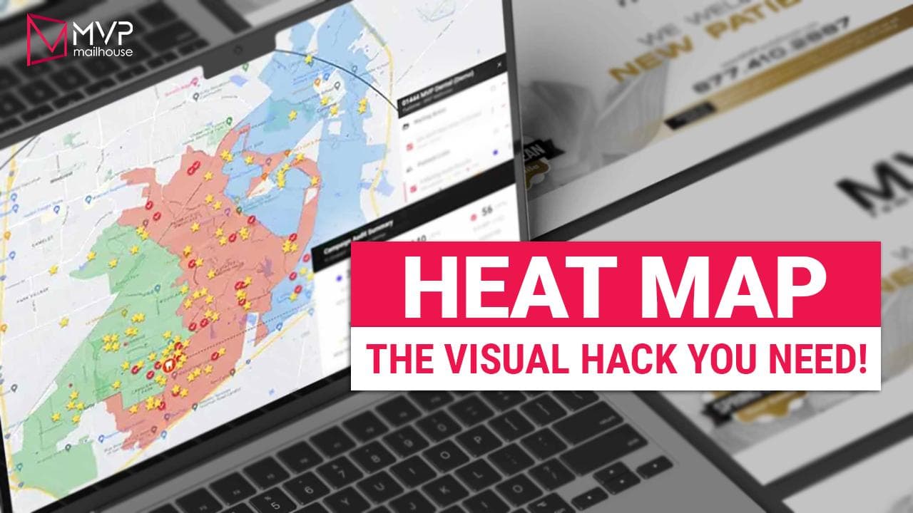
Geographic Heat Maps (Direct Mail & Local Marketing)
This is where things get especially powerful for industries like dental practices.
Instead of guessing which neighborhoods to target, geographic heat maps show exactly where responses originate. You can see clusters of high-performing areas and adjust your mailing strategy accordingly.
This approach aligns with broader strategies in location-based marketing, where proximity and demographic alignment drive results.
In real campaigns, this often leads to sharper targeting, reduced waste, and significantly higher ROI.
Why Heat Maps Matter More Than Ever
Marketing has shifted. Broad targeting is fading, and precision is taking over.
Heat maps sit right at the center of that shift.
In practice, campaigns that rely on visual data interpretation consistently outperform those that don’t. Not because the tools are complex but because they simplify complexity.
Instead of drowning in metrics, marketers can focus on patterns that actually move performance.
And when budgets tighten as they inevitably do this level of clarity becomes non-negotiable.
Heat Map for Dental Marketing: Turning Local Data Into Patient Growth
Dental marketing lives and dies by geography. Patients don’t travel far for routine care, which means understanding where demand exists is often more valuable than simply increasing spend.
This is where heat maps shift from helpful to essential.
A heat map for dental marketing visualizes patient response, demographic density, and conversion trends across specific neighborhoods. Instead of guessing which areas are worth targeting, practices can see exactly where interest and revenue, originates.
In practice, dental campaigns that use location-based targeting backed by visual data consistently outperform generic outreach. The American Dental Association reports that over 70% of patients choose a dentist within 5–10 miles of their home, reinforcing how critical geographic precision is.
We’ve worked with campaigns where two adjacent zip codes produced completely different results, one generating steady new patient flow, the other barely breaking even. Without a heat map, both areas would have been treated the same. With it, budget was reallocated, and patient acquisition costs dropped by nearly 35% within a single quarter.
This approach becomes even more effective when paired with structured targeting strategies like targeted mailing lists for dental marketing, where demographic filters align with high-response zones.
The takeaway is simple: Better visibility leads to better patient acquisition decisions.
Heat Map for Direct Mail Marketing: Finding the Pockets That Actually Convert
Direct mail still works but only when it’s targeted with precision.
A heat map for direct mail marketing shows which areas generate the highest response rates based on past campaigns. Instead of mailing 10,000 households evenly, marketers can concentrate efforts on the 20–30% of areas that drive the majority of conversions.
The Data & Marketing Association reports that direct mail achieves a 4.4% response rate on average, compared to less than 1% for many digital channels. But that number climbs significantly when campaigns are geographically optimized.
Across campaigns, the pattern is consistent:
A small portion of locations often drives the majority of results.
Heat maps expose that imbalance.
For example, a dental practice running quarterly mailers might discover that specific neighborhoods consistently produce appointment bookings. By increasing mail frequency in those zones and reducing spend elsewhere, ROI improves without increasing total budget.
If you want to go deeper into execution, this is where how to use heat maps for direct mail targeting becomes critical, it bridges the gap between insight and action.
How Do Marketers Use Heat Maps to Improve ROI?
Heat maps are only valuable if they lead to better outcomes. The real advantage lies in how marketers apply them to refine campaigns over time.
In practice, high-performing teams use heat maps as part of a continuous optimization loop, not a one-time analysis.
Here’s how that typically plays out:
1. Identify High-Performance Zones
Marketers start by analyzing response data across geographic areas. Heat maps reveal which zones generate the highest engagement or conversions.
In real campaigns, it’s common to see 60–70% of conversions coming from less than 40% of the target area.
This insight alone can reshape budget allocation.
2. Reallocate Budget Toward What Works
Once high-performing areas are identified, spend is shifted accordingly.
Instead of evenly distributing resources, marketers double down on proven zones. Lower-performing areas are either optimized or removed entirely.
This strategy aligns directly with principles in calculating ROI from direct mail campaigns, where efficiency, not volume drives profitability.
3. Refine Targeting With Data Layers
Heat maps become even more powerful when combined with demographic and behavioral data.
For example:
- Age groups with higher response rates
- Household income levels
- Homeownership vs. renters
This layered approach transforms basic targeting into a strategic advantage.
It also ties closely into data analytics in direct mail marketing, where multiple data sources converge to guide decisions.
4. Track KPIs and Measure Performance Over Time
Heat maps are not static, they evolve with each campaign.
Marketers track key performance indicators like:
- Response rate by location
- Cost per acquisition (CPA)
- Conversion rate per zip code
By continuously updating heat maps, patterns become clearer, and decisions become sharper.
For a deeper look at performance tracking, explore direct mail KPIs and how they connect directly to campaign outcomes.
Improving ROI With Heat Map Analysis: What Results Actually Look Like
There’s a difference between theory and execution. When heat maps are used correctly, the results are measurable and often immediate.
Across campaigns, we’ve seen:
- 20–40% reduction in wasted spend by eliminating low-performing zones
- 15–25% increase in response rates after reallocating budget
- Faster campaign optimization cycles, often within 1–2 campaign drops
One dental campaign we observed shifted from broad targeting to heat map-driven segmentation. Within three months, patient acquisition costs dropped from $180 to $120 per patient, while overall appointment volume increased.
That’s not an outlier. It’s a pattern.
And it reinforces a key point:
Heat maps don’t just visualize data, they accelerate better decisions.
How Heat Maps Fit Into a Broader Marketing Strategy
Heat maps are powerful, but they don’t operate in isolation. They work best when integrated into a larger system of targeting, tracking, and optimization.
For direct mail campaigns, that system often includes:
- Smart audience segmentation
- Performance tracking frameworks
- ROI measurement models
This is why strategies outlined in how effective direct mail marketing is continue to emphasize data-driven decision-making over intuition.
In practice, heat maps act as the visual layer that connects all of these elements. They turn complex datasets into something actionable something teams can actually use to improve results.
How to Use Heat Maps Effectively in Your Marketing Campaigns
Understanding what a heat map is only gets you halfway there. The real advantage comes from execution, how you apply that insight to drive measurable outcomes.
In practice, the most effective campaigns follow a structured approach. Not overly complex, but disciplined.
Step 1: Start With Clean, Reliable Data
Heat maps are only as accurate as the data behind them.
Before visualizing anything, ensure your data sources are consistent whether that’s CRM records, direct mail response tracking, or patient acquisition data. Incomplete or outdated datasets lead to misleading patterns.
Across campaigns, we’ve found that even a 10–15% data inconsistency can skew targeting decisions significantly, especially in smaller geographic areas.
If you’re building your foundation, this is where frameworks like measuring direct mail success for dental practices become critical, they ensure your inputs are reliable before optimization begins.
Step 2: Visualize and Segment Your Audience
Once your data is clean, map it out. Segment your audience based on:
- Location (zip codes, neighborhoods)
- Response behavior
- Demographics
This is where heat maps begin to reveal patterns, clusters of high engagement, pockets of underperformance, and unexpected opportunities.
In real-world campaigns, segmentation often reveals that a small percentage of areas drive the majority of revenue, reinforcing the need for focused targeting rather than broad outreach.
Step 3: Adjust Targeting and Campaign Strategy
This is where most of the value is unlocked.
After identifying high-performing zones, shift your strategy:
- Increase frequency in top-performing areas
- Test new messaging in mid-tier zones
- Reduce or eliminate spend in low-performing regions
This approach aligns with broader optimization strategies in smarter direct mail targeting, where efficiency consistently outperforms volume.
In practice, campaigns that actively reallocate budget based on heat map insights tend to see improvements within one to two campaign cycles.
Step 4: Continuously Test and Refine
Heat maps are not a one-time tool, they’re part of an ongoing process.
Each campaign generates new data. That data feeds back into your heat map, refining your understanding of what works.
Across industries, companies that continuously test and optimize campaigns see up to 30% higher marketing efficiency over time (McKinsey & Company).
The key is consistency.
Not perfection, iteration.
Common Mistakes Marketers Make With Heat Maps
Despite their simplicity, heat maps are often misused. And when that happens, they can lead to poor decisions rather than better ones.
Here are the most common pitfalls:
Overgeneralizing Data
Not all “hot zones” are equal. A high-response area in one campaign doesn’t guarantee future performance without context.
Seasonality, offer type, and competition all play a role.
Ignoring Supporting Data
Heat maps show where performance happens but not always why.
Without layering in demographic or behavioral insights, decisions can become surface-level.
This is why integrating broader analytics like those discussed in data analytics in direct mail marketing is essential.
Failing to Act on Insights
This is the most common issue.
Marketers generate heat maps, review them briefly, and then continue running campaigns the same way.
Insight without action doesn’t improve ROI.
Execution does.
What Results Should You Expect From Heat Map Marketing?
When implemented correctly, heat maps don’t just improve campaigns, they reshape them.
Across campaigns, realistic outcomes include:
- 15–30% increase in response rates after optimizing targeting
- 20–40% reduction in wasted spend by eliminating low-performing areas
- Faster optimization cycles, often within 30–60 days
For dental practices, this often translates into:
- More consistent patient acquisition
- Lower cost per new patient
- Better predictability in campaign performance
The timeline is typically short. Most campaigns begin seeing measurable improvements after 1–2 mail drops or campaign cycles, assuming data is properly tracked and applied.
Final Thoughts: Why Heat Maps Are a Competitive Advantage
So, what is a heat map really?
It’s more than a visualization tool. It’s a way to see what your audience is already telling you, clearly, quickly, and without guesswork.
In a landscape where marketing budgets are scrutinized and competition is increasing, relying on assumptions is no longer sustainable. Heat maps replace that uncertainty with clarity.
They show where to focus.
Where to cut back.
And where real growth is happening.
Marketers who embrace this approach don’t just run campaigns—they refine them continuously, making each iteration more efficient than the last.
Ready to Turn Data Into Predictable Growth?
If your campaigns still rely on broad targeting or inconsistent results, it’s time to shift toward a more precise, data-driven approach.
The difference isn’t subtle.
It’s measurable, in patient volume, ROI, and long-term growth.
If you’re ready to build campaigns that consistently generate results instead of hoping for them, start using heat map analysis as part of your strategy and turn your marketing into a predictable acquisition engine.
Tags
Frequently Asked Questions
Related blog