How Does A Heat Map Work in Direct Mail?
How does a heat map work in direct mail for dental marketing? Pinpoint high-response areas, optimize ROI, and attract more patients. Start targeting smarter now.

MVP Marketing
marketing manager
·13 min read
·Jul 3, 2025
In dental marketing, knowing what works—and what flops—is everything. That’s where heat maps come in. You might think they’re just for websites or online stores. Nope. They’re just as powerful offline. In fact, they’re turning into a must-have for direct mail, especially for dental clinics that want to attract local patients and get strong returns.
So, how does it work?
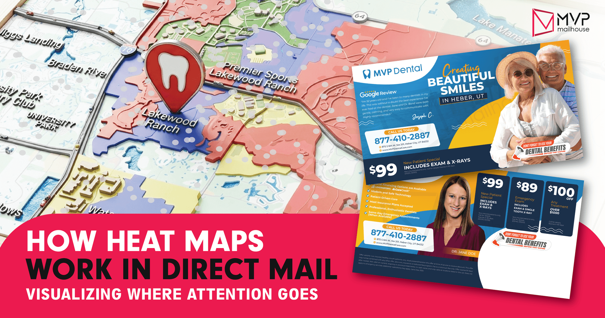
A heat map takes raw data and turns it into a picture. Usually, it’s a color-coded map. Red means lots of responses. Blue? Not so much. Now picture this: you send out a bunch of mailers. Later, you see a map showing which neighborhoods replied the most. No guessing. No hoping. Just proof.
For dentists, this is gold. Dental care is local. People want someone close. Not miles away. Not across the city. Just nearby, familiar, and trusted. A heat map tells you where people are calling from. One suburb might light up red. Another? Ice cold. That tells you where to send more mail—and where to tweak your strategy.
And there's more. You can stack extra info on top. Income levels. Insurance data. Demographics. That means you’re not just seeing where people respond. You’re seeing who they are. You can cut waste, focus better, and make sharper choices.
In short, heat maps help you spend smarter. Not more.
Dental marketing doesn’t need more noise. It needs sharper tools. With heat maps, you mail less but win more. That’s not just smart—it’s strategic.
What Is a Heat Map in Direct Mail?
Before we dive into how heat maps function within a direct mail campaign, let’s first unpack what a heat map really is—and why it matters.
A heat map is a dynamic visual tool that transforms raw data into a color-coded gradient, making complex patterns instantly digestible. At a glance, it shows where activity is most intense (the “hot” zones) and where it lags (the “cold” zones). Think of a heat map as a thermal lens over your data: the red and orange areas radiate high engagement or strong responses, while blue and gray zones reveal underperforming segments or disengaged recipients.
In digital marketing, heat maps often analyze website interactions—like where users click, scroll, or hover. But in the realm of direct mail marketing, the application is geographic and strategic. These maps allow marketers to visualize how different regions, ZIP codes, or neighborhoods are responding to a specific mail campaign. Did the postcard perform better in urban clusters versus suburban sprawl? Did households in a specific demographic zone show higher conversion rates? A heat map answers these questions at a glance.
This granular visibility enables campaign optimization on a hyperlocal level. You can reallocate budget to areas with high engagement, adjust messaging in underperforming zones, or test different formats and offers in real time. What emerges is not just a visual—but a strategy roadmap for your next mail drop.
Want to dive deeper into the broader marketing use cases for heat maps, including UX and digital conversion paths? Visit our post on what is a heat map in marketing.
The Mechanics: How Does a Heat Map Work in Direct Mail?
1. Launch the Campaign. Start Tracking.
Want results? Start with a good offer. It might be teeth whitening. A free cleaning. Or a reminder that insurance benefits expire soon. Back-to-school specials work great, too. The goal? Get noticed.
But here’s where smart campaigns stand apart: tracking.
Each mail piece needs its own fingerprint. Think:
- A QR code that links to a personal page.
- A unique phone number for each area.
- Promo codes based on ZIP codes.
- Custom web links for certain groups.
When someone scans, dials, or types, the system logs it. Automatically. It tags that action with details—like ZIP code, neighborhood, even the street. It’s location-specific. It’s real-time.
This isn’t just mail. It’s a response map in the making.
2. Sort the Data by Location
The moment people start responding, the system gets busy. Every scan or call is sorted. And sorted again. This time, by geography.
Why? Because dental practices need local results. People don’t drive 30 miles for a cleaning. Usually, they stay within 5 to 15 miles. That’s your strike zone.
Here’s what the data tells you:
- Which ZIP codes get calls?
- Are some areas full of new appointments?
- Which places don’t respond at all?
- Do newer neighborhoods respond better than old ones?
This part is gold. It shows not just who replied—but where. That’s your edge. Especially in busy suburbs or areas with lots of rentals. Knowing which block works lets you hit the target again next time—with more accuracy.
3. Paint the Picture with Color
Now it gets visual. Numbers turn into colors. The heat map is born.
With tools like MVP Mailhouse—or any good platform—you can watch the map light up.
It might look like this:
- Red zones: Lots of calls, lots of clicks. Keep mailing here.
- Orange zones: Some activity. Worth testing more.
- Blue zones: Weak results. Something’s off.
- Gray zones: Nothing. Maybe they’ve seen it too often.
This view gives you power. You can:
- Focus more on red zones next time.
- Stop wasting money on gray ones.
- Try new offers in the orange zones.
- Cut out the weak spots entirely.
The point isn’t just to mail once and hope. It’s to learn. Adjust. Improve. Campaign after campaign.
In dental marketing, small changes mean big gains. And with heat maps, you’re not guessing. You’re growing—with a plan.
How Does A Heat Map Work in Direct Mail?
Understanding how does a heat map work in direct mail marketing is only half the story. The real value lies in using those insights to make smarter, more effective decisions that grow your dental practice. Once you’ve gathered response data and visualized it geographically, you unlock a blueprint for how to refine your strategy for better results.
Let’s explore exactly how heat maps can influence, enhance, and elevate your marketing campaigns.
1. Pinpointing High-Value Areas
Heat maps are a powerful tool in direct mail marketing. They don’t just show where your campaign landed—they show where it worked. For dental practices, this isn’t just about ZIP codes. It’s about seeing behavior. Demand. Preferences. In real communities.
Take young families. These areas often light up in response to promotions like free first visits or cavity checkups for kids. It’s a clear signal. They care about pediatric dental care.
Now shift to affluent suburbs. What catches their eye? Elective treatments. Whitening. Veneers. Invisalign. Not the basics—these folks want to enhance, not just maintain.
Then there’s the college crowd. Students, renters, short-term residents. They want things fast and cheap. Payment plans. Same-day appointments. Budget care. Hit those notes, and they respond.
This is where heat maps shine. You’re not guessing. You see what works. You stop sending the same message everywhere. Instead, you target the areas that bite. You spend smarter, not more.
You pull back from cold zones. You double down on hot spots. That shift alone boosts your return. More booked chairs. Less waste. Same budget. Better results.
This is how smart dental marketers grow. Not with noise. With precision. With clarity. With results that show up—not just in reports, but in waiting rooms.
According to the 2024 Direct Mail Response Rates by Industry Report, healthcare providers—including dental practices—achieved an average direct mail response rate of 3.38%, surpassing the overall industry average of 3.63%. This confirms how effective heat map-guided targeting can be when combined with a compelling offer and relevant message.
By spotting these patterns, you can double down on what’s working. Instead of casting a wide, expensive net, you concentrate your budget on zones that actually convert. This ensures higher ROI and better appointment volume for the same—or even reduced—spend.
2. Customizing Messages Based on Geography
Heat maps aren’t just maps. They’re your marketing truth-tellers. In direct mail, especially for dental practices, they don’t just show where your flyers landed—they show who actually cared. Who noticed. Who acted. And it’s not just ZIP codes—it’s real people, living real lives.
Picture a neighborhood full of young families. Those maps light up fast. Why? Offers like free first visits or cavity checks for kids. Parents notice. They act. Pediatric care matters to them—and your map proves it.
Now think richer suburbs. The tone shifts. Basics don’t do much here. But mention veneers, whitening, Invisalign? That’s where you see a spark. These patients aren’t just maintaining their smiles—they’re upgrading. And they’re willing to pay for it.
College towns? Totally different beast. Students, renters—they move fast and think cheap. They’re in for same-day cleanings, payment plans, weekend slots. Keep it quick. Keep it easy. That’s what lights their map up.
And that’s the beauty of heat maps. They cut through the guesswork. You stop sending the same message to everyone. You stop wasting money. You start hitting the right targets, in the right way, at the right time.
Cold zones? Let ‘em go. Hot zones? Pour it on. That one move—just that—can flip your campaign. Suddenly, you’re filling chairs without spending more. Less waste. More wins. Same budget.
This isn’t spray-and-pray. This is strategy. Precision. It’s how smart dental marketers get real results. Not just metrics. But people in your office. Butts in chairs. That’s what matters. That’s what works.
3. Improving Campaign Timing and Frequency
Geographic targeting is important—but timing? That’s where real impact happens. A campaign sent at the wrong time can fall flat. Sent at the right time? It soars. Heat maps help with this. They don’t just show where your audience is. They show when they’re most likely to act.
Think about it. One suburb might respond like clockwork in late summer—back-to-school season. Another nearby area? Maybe they light up in the first quarter, when people get fresh insurance, new budgets, or just start the year with goals. That’s not random. That’s a pattern. A signal. Use it.
Here’s how you take advantage of that kind of insight:
Send your mail when people are ready to decide. Hit that moment of attention—don’t miss it.
For areas that act fast? Show up more often. Stay in their head while they’re still deciding.
If an area goes quiet? Hit pause. Come back later. Don’t burn money or annoy your audience.
Over time, this rhythm becomes second nature. Your campaigns start learning. They react. They get smarter. What began as a simple heat map becomes something else entirely—a system that adapts and fine-tunes itself every time you hit send.
And the best part? You’re not just getting better results. You’re building a machine. A marketing engine that grows sharper, faster, more effective—campaign after campaign.
4. A/B Testing That Goes Beyond Guesswork
Think about this. Your dental office runs an A/B test. Two direct mail offers go out. One says “Get a free teeth whitening.” The other? “$59 for a new patient exam.” You split your service area in half. Each group gets one version.
Now here’s the difference. You don’t just look at some numbers on a spreadsheet. You pull up a heat map. It shows you, zip code by zip code, where each offer landed best. It’s instant. And it’s clear.
The guessing? Gone.
Patterns jump out.
Some neighborhoods go for the cheaper deal. That tells you cost matters there. So next time? Push affordability.
Others lean into the free whitening. That means looks matter more than price in those places. A brighter smile wins.
Then you spot hot zones—places where lots of people respond. And cold ones—where they don’t. Just like that, you know where your message hit and where it didn’t.
It’s not just data. It’s behavior. Real insights from real people. You’re no longer testing in the dark. You’re learning. Adjusting. Sharpening the next round.
You don’t guess what your audience wants. You know. And then you act on it.
That’s A/B testing with clarity. Fast. Focused. Smart.
5. Allocating Budget Strategically
Knowing where your patients come from—both physically and in how they act—gives you an edge. You can stop guessing and start spending smart. Don’t spread your budget thin. Use tools like heat maps and call tracking to find out which areas or platforms bring in real results. Focus there.
Double down on success.
If certain zip codes or neighborhoods bring in the good patients—insured, reliable, high-value—go all in. Those spots aren’t just working; they’re working hard. Hit them with more ads. Send more mail. Run targeted social campaigns. Make it harder for your competitors to break in.
Now cut what’s not working.
Some areas stay cold no matter what. That’s okay. Pull back. Stop wasting money. It’s not a loss—it’s smart strategy. Use that freed-up budget where it can make a real difference.
Put the savings to work.
Use it for better offers. Better design. Smarter targeting. Think about who you’re talking to—age, income, family size—and shape your message around them. Or expand. Try new things. A second round of mail. A test run on a new platform like geofencing or Nextdoor.
In crowded markets, every dollar counts. Urban, suburban—it doesn’t matter. Precision isn’t a luxury. It’s a necessity. When you aim your budget with data, you stop gambling. You stop guessing. And you start growing—with purpose.
Integrating Heat Maps with Broader Dental Marketing Tactics
To get the most out of your direct mail campaigns, heat maps shouldn’t exist in a vacuum. They should be part of a larger, data-driven strategy that brings together targeting, messaging, and continuous optimization. When integrated thoughtfully, they enhance every aspect of your dental marketing efforts—from campaign planning to follow-up.
Pairing Heat Maps with Patient Data
Heat maps are more than colorful visuals. On their own, they don’t say much. But when you add real patient data? They become powerful. They help you make smart, targeted marketing moves.
Start asking better questions. Smarter ones.
Where are your new patients coming from? Do they bunch up in a few ZIP codes? Or are they spread out? That tells you where to send your next batch of mail. Focus on the hot spots. Or try new areas you haven’t reached yet.
What do people want in each area? Maybe implants are big in high-income neighborhoods. Maybe cleanings rule in others. Use that knowledge. Match your message to the location.
How are people responding? Are they walking in? Or booking online? That difference matters. It helps you prep your front desk. Schedule better. Train your team to handle both.
This isn’t just about marketing. It’s about operations. Smarter staffing. Smarter inventory. Smarter promotions. You’re not guessing anymore. You’re tuning your practice like a high-performance machine.
Connecting Offline and Online Tracking
Direct mail has evolved. It’s not just paper in a mailbox. It’s a real-world link to your digital world. When you pair it with online tools, everything sharpens. Your ROI gets clearer. Smarter.
Put action into every mail piece.
Add QR codes. Send people to landing pages made just for them.
Use special URLs. Track not just visits—but who booked.
Link to Google Maps. See who clicked for directions. Even if they didn’t call or fill out a form, that shows intent.
Try this:
After a mail drop, check how many folks from one ZIP code visited your “Schedule Now” page.
Then look at the patterns. Who’s booking online? Who isn’t? Maybe some areas need another push—a reminder card or a community event.
Don’t guess. Look at the data. Mix your heat map insights with digital signals—clicks, bounces, bookings.
Where both are strong? Invest more. Where they’re weak? Rethink.
When your offline and online efforts work together, you stop just tracking results. You start understanding behavior. And that insight? That’s the real win.
Conclusion
So, how does a heat map work in direct mail?
It works by transforming anonymous response data into a clear, visual story—one that shows you which neighborhoods are engaging, which offers are converting, and where your marketing dollars are making the biggest impact. For dental practices, this means smarter outreach, better resource allocation, and ultimately, more patients in your chair.
Key Takeaways:
- Heat maps track response by geography, showing hot and cold zones.
- Dental marketers can use them to target better, test smarter, and spend more effectively.
- Campaign performance becomes visible, actionable, and scalable.
When done right, direct mail marketing with heat maps is no longer guesswork—it’s strategy backed by data and guided by results.
Ready to take your dental direct mail to the next level? Let us help you launch smarter campaigns, drive more calls, and fill more appointments. Visit our website to learn more and get started today.
Tags
Frequently Asked Questions
Related blog