How to Write a Call to Action in Direct Mail Marketing
How to write a call to action that converts in direct mail marketing. Create urgency, boost response rates, and drive real results. Start crafting yours now!

MVP Marketing
marketing manager
·10 min read
·Jun 6, 2025
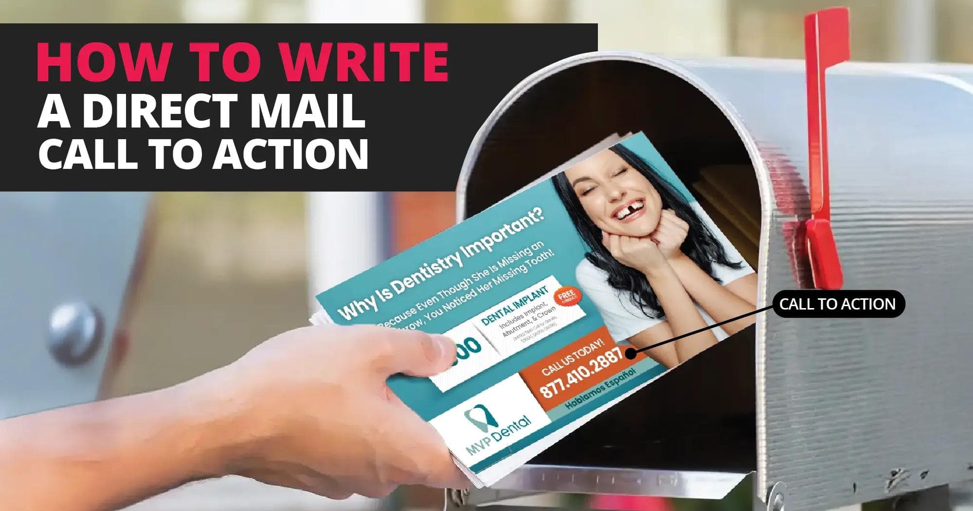
When it comes to direct mail marketing, your call to action (CTA) is the bridge between attention and conversion. It’s the line that tells your audience what to do next and when written effectively, it transforms interest into measurable results.
Yet, many campaigns fall short because the CTA feels generic or unclear. Understanding how to write a powerful, persuasive call to action is crucial to making every mailer count.
Understanding the Purpose of a Call to Action
A call to action isn’t just a line of text, it’s a spark. A small push that turns curiosity into movement. It tells your reader what to do next, guiding them from interest to intent. Without it? Even the most stunning design can fall flat, lost in the noise.
Think about it. In direct mail marketing, the CTA has real weight. The recipient isn’t just reading, they’re touching your message. That tactile moment matters. It’s physical, memorable, human. Unlike a digital ad that vanishes with a scroll, direct mail stays. It sits on a counter. It waits for a decision. Keep it. Act on it. Or toss it. Your CTA often decides which one they choose.
A powerful CTA is never random, it’s deliberate. Built with clarity, emotion, and timing. It should speak directly to what people care about: saving time, feeling special, getting more value. Simple, strong phrases like “Book Your Free Consultation Today” or “Claim Your Offer Before It’s Gone” work because they create urgency. They reward action. They make it easy to say yes.
Remember this: the best CTAs aren’t just clever, they’re strategic. They come from understanding your audience, knowing their hesitations, and removing their friction. A great CTA doesn’t just ask. It inspires. It transforms a fleeting glance into action. A moment of attention into measurable results. As discussed in our guide on why strong calls-to-action matter in direct mail marketing, a well-crafted CTA can drastically improve your mailer’s success rate by reducing hesitation and providing clear direction.
Elements of an Effective CTA
A call-to-action isn’t just a button or a phrase, it’s the heartbeat of your marketing message. The spark that moves people. The bridge between interest and action.
An effective CTA does one thing really well: it gets people to act. But how do you make that happen? Through clarity, urgency, and benefit-driven language. Let’s break it down.
Be Specific
Don’t dance around the point. Be clear. Be bold.
“Learn More” means nothing. “Call Now” sounds tired. Instead, spell it out: tell your audience exactly what they’re doing and why it matters.
Example: “Book your free dental consultation today and save 20% on your first visit.”
Short, clear, and loaded with value. They know what they’re getting and what to expect. That’s trust in action.
Add a Sense of Urgency
People act when time feels short. It’s psychology, simple but powerful.
Try phrases like “Limited Time Offer” or “Only 5 Spots Left.” They whisper urgency, and suddenly waiting feels risky.
Even a gentle push like “Offer ends soon” lights a spark. Urgency turns hesitation into momentum.
Make It Easy to Act
A good CTA removes barriers. A great one removes friction entirely.
Don’t make users dig for links or type long URLs. Use QR codes, short links, or scannable coupons that get them exactly where they need to go, instantly. In fact, using QR codes can make your CTA more effective, as covered in Benefits of Using QR Codes in Direct Mail Marketing.
This isn’t just convenience. It’s connection. QR codes bridge print and digital, giving users one smooth, effortless path from curiosity to conversion.
Focus on the Reader’s Benefit
Here’s the secret: your CTA isn’t about you. It’s about them.
Swap “Call us today” for “Get your free quote in minutes.” Replace “Schedule an appointment” with “Start saving on your next visit.”
See the difference? One asks. The other offers.
When your CTA speaks their language benefits, results, rewards it stops feeling like a command and starts sounding like an opportunity.
The Psychology Behind Action
Why do people click? Why do they buy, sign up, or say yes? It’s not random. It’s psychology, a mix of desire, logic, and impulse working together in the background. The best CTAs tap into all three.
Every tap, every form submission, every purchase starts with a feeling. Then logic steps in to justify it. Good marketers understand that dance. They make action feel natural, almost effortless.
Incentives. People love rewards. Simple as that. A small nudge “Get 20% off today only” triggers the brain’s reward center. Suddenly, the offer feels urgent, personal. It’s not just a sale; it’s an opportunity that might slip away. That fear of missing out? Powerful.
Emotion. Logic explains, but emotion moves. Excitement, curiosity, relief — these are the sparks that make people click. Words like “Unlock,” “Discover,” and “Transform” do more than sell; they speak to a deeper need. Everyone wants to feel progress, to move closer to something better, safer, happier.
Simplicity. Clarity cuts through noise. A great CTA doesn’t make people think; it makes them act. Short, clean, direct. No friction. No confusion. When a message is easy to understand, the brain relaxes and says yes faster.
In the end, it’s about balance. Reward the mind, stir the heart, and remove the barriers. When you combine incentive, emotion, and simplicity, your CTAs stop feeling like commands. They become invitations.
People don’t act because they’re told to. They act because they want to.
How CTAs Influence Conversion in Direct Mail
Every part of your mailer matters. The design, the copy, the layout, all of it should lead the reader straight to your call to action (CTA). That’s your centerpiece. The magnetic pull. The moment where curiosity becomes motion.
Your CTA isn’t just a button or a catchy line. It’s the pivot point of your message, the point where interest flips into engagement. When done right, it doesn’t just sit there waiting to be clicked. It guides the reader forward. In our post, Direct Mail Marketing Tips: Strategies to Boost Conversion, we explore how small design choices like CTA placement, contrast, or tone, can lift your response rate and fuel your campaign’s success.
But don’t stop at how it looks. Go deeper. Measure it. Check your response rates, QR code scans, and landing page visits. These numbers tell the real story. Sometimes, one simple tweak, a stronger verb, a more tempting offer, or a fresh placement, can change everything.
Keep testing. Keep refining. A great CTA is never finished. It learns, adapts, and evolves. With each experiment, it grows stronger until it becomes more than just a line of text. It becomes momentum.
Increasing Conversion in Direct Mail
So, you’ve nailed your call to action. Great. But here’s the real test turning that message into action. Every detail counts. Words, colors, layout, they all guide the eye, shape emotions, and drive results. In direct mail, conversion is part art, part science. Timing, testing, and smart design make the difference between a glance and a response.
1. Place Your CTA Where It Works Hardest
People read in patterns usually a “Z” across the page, from top left to bottom right. That means your CTA needs to live where the eyes land naturally. Don’t bury it. Show it off.
- Use contrast and whitespace so it stands out.
- Add arrows, icons, or color accents to lead attention.
- Repeat it, once mid-message, again at the end.
Simple rule: make it easy to see, easy to act. When your CTA is visible, your conversions rise.
2. Make the Offer Feel Worth It
A CTA alone isn’t enough. People need a reason. A push. Something that says, “This is worth my time.”
Make your offer shine by adding:
- Exclusive deals: time-limited discounts or special perks.
- Low-risk hooks: free trials or consultations.
- Extra rewards: free upgrades, guides, or kits.
Here’s an example:
“Schedule your free smile assessment today and receive a complimentary whitening kit.”
Short, clear, emotional. It promises value and urgency, a combo that moves people.
3. Give People More Ways to Respond
One path isn’t enough. Everyone prefers a different way to act — scan, click, call. Meet them where they are.
Try this:
- QR codes that link to a video or booking page.
- Custom URLs (PURLs) for personalized tracking.
- Dedicated phone lines with real humans or smart schedulers.
Multiple doors. Same destination. More responses.
4. Let Data Do the Talking
Guesswork is for amateurs. Data is where you learn what works and what doesn’t.
Keep an eye on:
- Response rate: who engaged.
- Conversion rate: who took the next step.
- ROI: how much you earned per dollar.
Then, test again. Change your CTA wording. Adjust colors. Swap incentives. Track the lift. Small tweaks can lead to big payoffs. For a deeper dive into response optimization, check out how to increase direct mail response rates, which outlines proven strategies for tracking and boosting campaign performance.
5. Test. Refine. Repeat.
Direct mail is never one-and-done. It’s a cycle. Each campaign teaches you something new.
Run A/B tests:
- Version A: “Call for a free estimate.”
- Version B: “Transform your space today, call for your free estimate.”
See which one wins. Then do it again. Over time, you’ll see patterns, the words, tones, and visuals your audience loves most.
6. Keep Your Message and Offer in Sync
Nothing kills trust faster than inconsistency. If you promise a “free consultation,” your CTA should lead straight there, not to a random form or generic page.
Everything should connect: the headline, the body, the CTA. One story. One action. No confusion.
You don’t need louder headlines or flashier designs. You need clarity, relevance, and consistency. A good CTA is a guidepost, it tells your reader what to do next, and why it matters.
Place it right. Make it valuable. Keep testing. When you do, you’ll turn casual readers into committed customers and that’s real conversion.
Direct Mail Best Practices for Creating Powerful CTAs
A call to action isn’t just a few words tacked on at the end. It’s the heartbeat of your mail piece, the moment everything comes together. Every color, line, and headline should guide the reader to that one decision: act now.
When your CTA flows naturally from your message, it stops feeling like marketing. It feels like momentum. That’s when a campaign moves from good to unforgettable the kind that earns clicks, calls, and customers.
As covered in Direct Mail Best Practices for a Successful Campaign, the foundation of a successful mailer comes down to three key principles: relevance, clarity, and consistency. Let’s see how these tie directly into your CTA strategy.
1. Stay Consistent. Stay Focused.
Clarity wins. Always.
The best direct mail pieces lead readers straight down one path, no detours, no distractions. Every sentence should serve one goal: getting that action.
If your CTA says, “Book a Free Consultation,” make sure everything else supports it. Talk about the benefits of the consultation. Show the success stories. Keep your tone confident and helpful. The more aligned your message, the easier it is for readers to trust and respond.
Disjointed mail confuses people. Cohesive mail converts them.
2. Let Design Do the Talking
Even the best CTA won’t work if it’s hiding in the corner. Make it shine.
Big, readable text. Clean space around it. A pop of color that draws the eye. Design should point like an arrow straight to your CTA.
And your words? Keep them real. No jargon. No cold commands. Instead of “Submit Request Form,” say “Claim Your Free Estimate.” It sounds friendly. Inviting. Human.
Small change, huge difference.
3. Personalize, Always
People act when they feel seen. That’s the magic of personalization.
A name. A city. A detail that says, “We know you.” It’s simple but powerful.
Try this:
“Smile brighter this fall, schedule your free cleaning today.”
Short. Seasonal. Specific. It connects instantly because it speaks to them, not everyone.
That’s how mass marketing becomes personal marketing.
4. Bridge Print and Digital
Direct mail doesn’t live alone anymore. It’s part of a bigger ecosystem, one that flows right into the digital world.
Add a QR code. A custom URL. A tap-to-visit tag. Make it effortless for people to move from the mailbox to your website.
And here’s the bonus: you get data. Real data. You’ll see which CTAs drive the most scans, clicks, and conversions. That feedback lets you refine, test, and optimize for even better results.
You’re not just sending mail. You’re creating a response engine.
A great CTA isn’t clever, it’s clear. It’s consistent, visible, and personal. It bridges the physical and digital worlds without friction.
When every piece of your direct mail works in sync, your CTA doesn’t just ask for action, it earns it.
That’s the difference between a mailer that’s read… and one that gets results.
Conclusion
Learning how to write a call to action for direct mail marketing is both an art and a science. The most effective CTAs are clear, benefit-driven, and supported by a cohesive campaign strategy. When done right, they can transform your mailers from simple promotional pieces into high-performing conversion tools.
By combining thoughtful design, strong messaging, and a focus on user experience, your direct mail campaigns can achieve powerful results — whether you’re promoting a product, a service, or a special offer.
Ready to create high-converting direct mail that gets noticed and drives action?
Visit MVP Mailhouse to learn more or schedule a demo today to see how our proven strategies can elevate your next campaign.
Tags
Frequently Asked Questions
Related blog