How Design Impacts Direct Mail Response Rates: A Breakdown
Dental postcard design that gets results—fast. Grab attention, earn trust, and drive action with local, personalized direct mail. Start now.

Vaughn Ong
senior designer
·13 min read
·Jun 20, 2025
Direct mail still works. Really well. Especially for dentists. Why? Because people trust people they feel close to. Local names. Familiar places. A smile they’ve seen before.
But here’s the deal—it’s not about sending any mail. It’s about sending the right mail.
Digital ads? Everyone sees them. Everyone scrolls past them. But a postcard in the mailbox? That’s rare now. It gets noticed. It gets held. It gets read.
Still, design makes or breaks it.
If your postcard design looks boring? It’s going in the trash. If it’s cluttered? It gets skipped. If it feels generic? It gets forgotten. Strong design isn’t optional—it’s what makes people stop, look, and take action.
Great design grabs attention—fast. It guides the eye. It sparks interest. And most importantly, it drives action.
Use bold colors. Strong headlines. Clear fonts. Big, clean space. Don’t cram.
Want better results? Personalize it. Use their name. Mention their town. Highlight services that fit—whether it’s for kids, seniors, or families. Personal touches matter. They turn a postcard into a conversation.
This isn’t art class. It’s behavior science. Color makes people feel. Words move them. Images create trust. Design tells a story, even before they read a word.
For dentists who want to stand out, this is the edge. This is how you win your neighborhood.
Smart design. Clear message. Local focus.
That’s the formula.
1. Eye-Catching Visuals
In direct mail, the first glance is everything. It’s your shot to stand out—or get tossed. People sift through bills, flyers, and junk mail in seconds. You’ve got maybe three, five tops, to catch their eye. That’s it.
So how do you make them look twice? Visuals.
Not just pretty pictures. Not filler. We’re talking strategic, high-impact, emotion-driven design—imagery that hits home and makes people feel something.
Quick Fact:
The brain processes images 60,000 times faster than text.
So your visuals? They need to speak instantly—no caption required.
Do This:
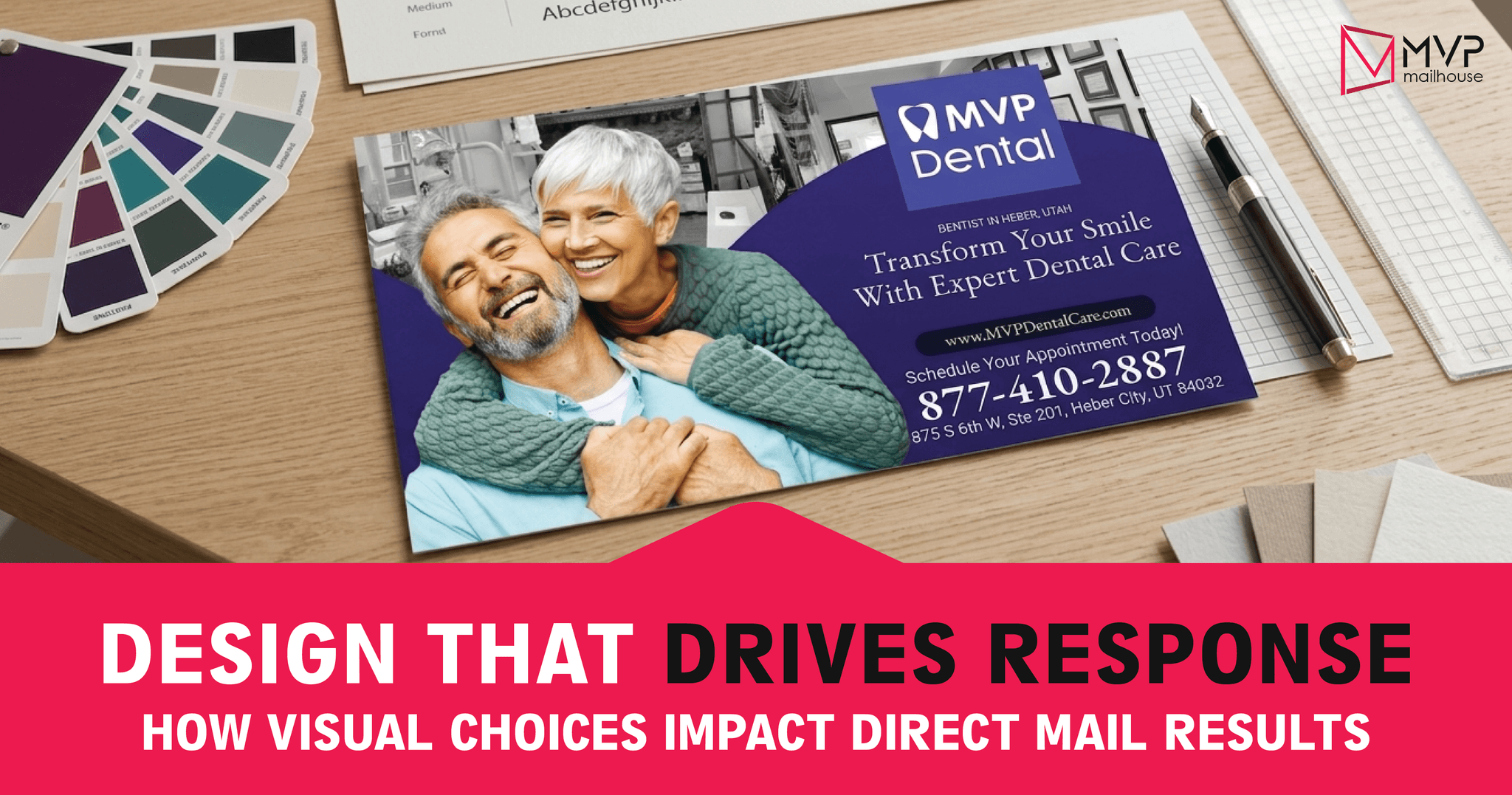
- Show Real Emotion.
- Skip the stiff stock photos. If you’re a dentist, ditch the fake smiles. Show real patients—beaming, proud, post-treatment. That’s what connects. That’s what sticks.
- Use Color With Purpose.
- Color isn’t just decoration—it speaks.
- Blue = trust, calm, cleanliness (ideal for healthcare, finance).
- Red = urgency, excitement, attention (great for promos).
- Color isn’t just decoration—it speaks.
Stay on-brand, but be intentional. Every color should earn its spot.
- Think Mailbox-First.
- Your design has to pop in a pile of beige envelopes. Use contrast. Go bold.
- Design with Flow.
- Create a visual path.
- First: Start with the image—bold, emotional, relevant.
- Then: The headline—short, punchy and direct.
- Finally: End with the CTA—urgent, clear, impossible to ignore.
- Create a visual path.
Skip These Common Mistakes:
Clutter = Confusion.
Too much going on? People will check out—fast.
Use white space. It breathes. It guides. It matters.
Cheesy Stock Images.
Your audience can tell. They’ve seen that same smiling frontdesk staff a thousand times.
Be real. Be original. Use authentic visuals that reflect your brand and your patients.
Want your mail to be remembered?
Make them feel something—before they even read a word.
2. Clear & Compelling Messaging
Design Isn’t Just Visual — It’s Mental Too
Looks catch the eye.
Words seal the deal.
In marketing, your visuals might stop the scroll, but your message? That’s what moves people. It’s the bridge between attraction and action.
Great messaging taps into how people think, feel, and decide. If they don’t “get it” right away?
You’ve lost them—and your offer goes with it.
Why It Matters
People don’t read. They skim. Fast.
The Nielsen Norman Group found users often scan in an F-shape — headline, left edge, then gone.
So if your headline flops? So does your ROI.
Best Practices (Backed by Real Brain Science)
Lead with a Bold, Outcome-Oriented Headline
Start with a promise, not a product. A strong headline answers the reader’s silent question:
“What’s in it for me?”
Example: “$99 New Patient Special – Includes Exam, X-Ray & Cleaning (Save $200)”
Notice the formula: [Low Risk] + [Clear Offer] + [Perceived Value].
Design for Skimmability
Use short sentences, active voice, and bullet points. People scan for relevance before they commit to reading. Format your copy to support that behavior.
Instead of:
“Our dental office provides comprehensive oral exams, diagnostic imaging, and professional cleanings…”
Say:
- Exam
- X-ray
- Cleaning
All for just $99!
Highlight Benefits, Not Just Features
Features describe what you offer. Benefits explain why it matters.
- Don’t say: “We offer teeth cleanings.”
- Do say: “Leave with a brighter, healthier smile—same day.”
Use Strategic Framing
The way you present your offer shapes its perceived value. Anchoring your price against a higher “normal” cost makes the discount feel more rewarding.
Example:
“Normally $299 — now just $99!”
That’s value anchoring. It's not just persuasive—it’s brain science
Emotional Resonance Wins
People make decisions emotionally, then justify them logically.
Use emotion-driven copy that speaks to their life, not just their teeth.
Example:
“Feel confident at your next meeting or date—without breaking the bank.”
Clarity > Cleverness
Don’t sacrifice clarity for creativity. A clever pun that needs deciphering is a conversion killer. If your grandma wouldn’t get it in 3 seconds, rewrite it.
Pro Insight:
Great messaging lives at the intersection of design, psychology, and marketing strategy. If you're designing a direct mail piece, email campaign, or landing page, treat your messaging as your conversion engine—not filler. Test it relentlessly. A simple A/B test on headline wording can often lift response rates by 30% or more.
Expert Tip: Use the “5-Second Rule” — show your ad to someone for five seconds. If they can’t tell you (1) what the offer is, (2) who it’s for, and (3) what to do next, your messaging needs refinement.
3. Strategic Use of White Space
White space, or negative space, gets a bad rap. Many see it as empty. Wasted. But smart designers know better. It’s not “nothing”—it’s a powerful something.
White space gives design room to breathe. It creates calm. It focuses attention. It’s not leftover space; it’s a tool. When used effectively, it guides the eye, improves reading, and makes everything feel more polished.
Why White Space Deserves More Credit
People judge a website in a blink. Literally—under 0.1 seconds. Before they read a word, they feel the layout. The spacing. The structure.
That’s where white space comes in. It’s the silent player setting the tone.
Here’s What White Space can do:
- Improve understanding by 20% – When text has room, it’s easier to read. People absorb more. They remember more.
- Increase engagement – Spacing gives the eye a path. Visitors follow it naturally. They stay longer.
- Boost perceived value – Think luxury brands. Clean layouts. Plenty of space. That’s not by accident—it’s by design.
Pro Tips for Better Use of White Space
- Give elements space to breathe. Crowded pages overwhelm users. Instead of packing it all in at the top, spread it out. Let the layout flow.
- Understand macro and micro whitespace.
- Macro white space is the big stuff—like the space between sections or around a hero image. It shapes the page and sets the rhythm.
- Micro white space is tiny but mighty—gaps between lines, letters, icons. It smooths out the reading experience and improves usability.
- Try the “isolation effect” (Von Restorff Effect). Want a CTA to stand out? Give it space. Don’t rely on loud colors or flashy animations. Space can do the work.
- Don’t fill every inch. It’s tempting to use every pixel. But restraint shows confidence. Clear beats clutter. Always.
Last Thought: White Space Isn’t Always White
The name’s misleading. White space doesn’t need to be white. It can be black, beige, or even blurred. As long as it separates and balances elements, it works.
Bottom Line: White space is design magic. Silent, but strong.
4. Strong Call-to-Action (CTA)
You can have a stunning design. A compelling offer. Flawless targeting. But if your audience doesn’t know what to do next, it all falls flat.
That’s the role of your Call-to-Action—the CTA. It’s not just a button or a catchy line. It’s the bridge between interest and action.
Why CTAs Matter So Much
A weak CTA causes confusion. It stalls momentum.
A strong CTA clears the path. It gives direction. It drives results.
Your CTA should answer the silent question:
“What should I do right now—and why?”
Tips for CTAs That Actually Work:
- Make It Pop: Your CTA needs to stand out. Think: bold fonts, High-contrast colors, and strategic placement (top third or bottom right). Even your envelope can act as a teaser CTA—“Open Now for $99 Dental Offer.”
- Use Urgent, Clear Language: Skip the weak stuff. “Learn more” is lazy. Be direct. Be urgent. Say what they get and why they should care—now. Try these:
- “Book Your Free Quote Today”
- “Grab 20% Off—Ends Tonight”
- “Scan Now—Get the Deal Inside”
- Give Them Options: Not everyone responds the same way. Some call. Some click. Others scan. Cover all the bases:
- A phone number for personal calls
- A URL that’s easy to remember and track
- A QR code for quick mobile access
- SMS opt-in for fast responses
- Meet them where they are.
- Show the Value: Don’t just say “Contact Us.” That’s vague. Say what’s in it for them. Example:
- Weak: “Contact Us”
- Strong: “Claim Your Free Estimate—Only 15 Slots Left”
Bonus Tip: Always Test, Always Track
Try different CTAs. Try different spots on the page. Test the words. Test the method. One version might flop—another might explode with results. Don’t assume. Use the data. Every audience responds differently. Keep refining.
Your CTA is the final push. The big finish. It has to be strong, clear, and hard to ignore. If it’s not moving people to act, then all the beautiful design, smart strategy, and money behind your mailer won’t matter.
5. Personalization & Relevance
Today’s mailbox is noisy. Most of what lands in it? Instantly ignored.
That’s why personalization stands out. It cuts through the clutter—not just visually, but emotionally. It doesn’t feel like junk. It feels like it was made for the person holding it. Because it was.
This isn’t a gimmick. It’s neuroscience-backed marketing. And when done right, it works incredibly well.
Why It Works
“Dear Resident”? Straight to the trash.
“Hi Sarah, We Think You’ll Love This”? That’s different. That’s personal. That gets opened.
Personalization signals intent. When someone sees their name, their city, their interests — they feel like the message is speaking to them. That recognition triggers attention. That attention builds trust. And trust drives action.
Here’s proof: A study by InfoTrends found that personalized direct mail can generate up to 135% more responses than generic versions.
But here’s the catch: it’s not just about using someone’s name. You need strategy, not surface-level.
You need a plan.
How to Make Your Direct Mail Campaign Truly Resonate
1. Use Variable Data Printing (VDP) Like a Pro
Modern printing technology offers powerful personalization tools through Variable Data Printing (VDP). This means you can customize elements such as the recipient's name, the headline, the imagery, and even the promotional offer—based on who’s receiving the mail.
Quick Tip: To make the most of this, think beyond just using a person’s name. Tailor the visuals and messaging to reflect the recipient’s lifestyle and dental needs. For instance, if you're mailing to young families, feature imagery and offers related to pediatric dental care or back-to-school checkups. On the other hand, if you’re targeting older adults, highlight services like dental implants or denture solutions. Matching your message to the moment makes your dental direct mail piece feel more relevant—and significantly boosts engagement and response rates.
2. Use More Than Just Age & Income
Demographics are a start. But psychographics? That’s the gold.
- What do they dream about?
- What problems are they trying to solve?
- Are they just browsing—or ready to buy?
Use purchase history. Browsing behavior. Customer type. Match your message to the moment they’re in.
3. Make It Feel Local and Personal
Familiarity builds connection. Local content = local love.
- Mention the city.
- Call out a local event or weather trend.
- Use neighborhood names.
Example: “Schedule Your Cleaning Today,” try something specific: “Free Whitening with Every Cleaning – This Week Only in Scottsdale!” It’s timely, location-based, and far more likely to grab attention.
Think of this as precision work. Not a megaphone. A magnifying glass. It’s not about reaching everyone. It’s about reaching the right one.
Done right, personalization doesn’t just get attention. It earns loyalty.
6. Trust-Building Elements
People are skeptical. They’ve seen it all. That’s why trust isn’t a luxury—it’s your starting line. When your mailer hits someone’s mailbox, you have seconds. Seconds to either make a connection or get tossed aside.
So how do you win them over fast? Your mailer needs to look trustworthy—but more than that, it needs to feel real. You build that feeling with subtle cues. The right image. A sincere message. A design that says, “We care.” These things speak to people—without them even realizing it.
Smart Ways to Build Trust in Your Mailer
Skip the “5 stars!” noise. Instead, share a story. Someone nervous. Someone who avoided the dentist for years. Someone who felt safe again. Like:
Think about someone who avoided the dentist for years because of fear or embarrassment—then finally found a practice that made them feel safe again. A simple sentence like,
“I hadn’t seen a dentist in 10 years. Dr. Smith made me feel at ease within minutes,”
speaks volumes. It tells a story of vulnerability, compassion, and transformation—all in one line.
Show the Humans Behind the Practice
Patients don’t connect with logos—they connect with people. Instead of relying on stiff, corporate-style headshots, bring your practice to life by showing real moments. Capture the warmth of your team with candid photos: a friendly smile at the front desk, a dentist sharing a light-hearted moment with a patient, or a hygienist gently walking a child through their first visit.
These glimpses into everyday interactions humanize your dental practice. They tell prospective patients, “We’re more than a clinic—we’re people who care.”
Use Trust Badges and Familiar Logos
ADA. BBB. Local dental associations. These logos do the talking for you. They say, “We’re legit.” And if you’re new? Highlight continuing education, certifications, anything that says, “We’re not just up to date—we’re ahead of the curve.”
Make It Feel Personal
A handwritten note (or one that looks handwritten) goes a long way. “Welcome to the neighborhood!” in a fun sticky-note graphic? It feels like a message just for them. That personal touch is tiny—but powerful.
Match Your Brand, Everywhere
Consistency is key when building trust and recognition. Your direct mail piece should reflect your practice’s unique colors, logo, and tone—the same look and feel patients experience on your website and social media. When your mailer feels off-brand or disconnected, it creates confusion and breaks trust instantly.
Along with visual consistency, add small local touches—a mention of the neighborhood, a nearby school, or a community event. This approach makes your dental practice feel approachable and familiar, not corporate or distant. Patients are more likely to trust a practice that feels like a friendly neighbor rather than a faceless business.
Conclusion
Great design is more than just aesthetics—it directly influences how recipients respond to your mailer. By combining eye-catching visuals, clear and compelling messaging, strategic use of whitespace, strong calls to action, thoughtful personalization, and trust-building elements, you can create direct mail pieces that not only capture attention but also drive meaningful results and maximize your return on investment.
At MVP Mailhouse, we specialize in crafting high-performance mailers tailored to your practice’s unique needs. Our designs are proven to engage patients and convert interest into appointments. Ready to elevate your next direct mail campaign? Contact us today to get started.
Be sure to explore our design templates page, where you’ll find the perfect postcard templates that help your dental practice stand out and build instant trust with your community.
Tags
Related blog